
 View live prototype
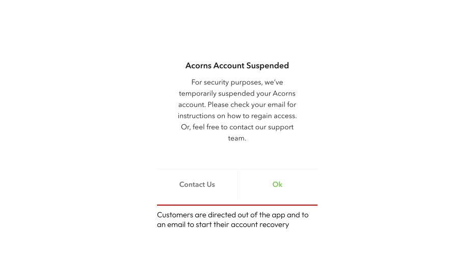
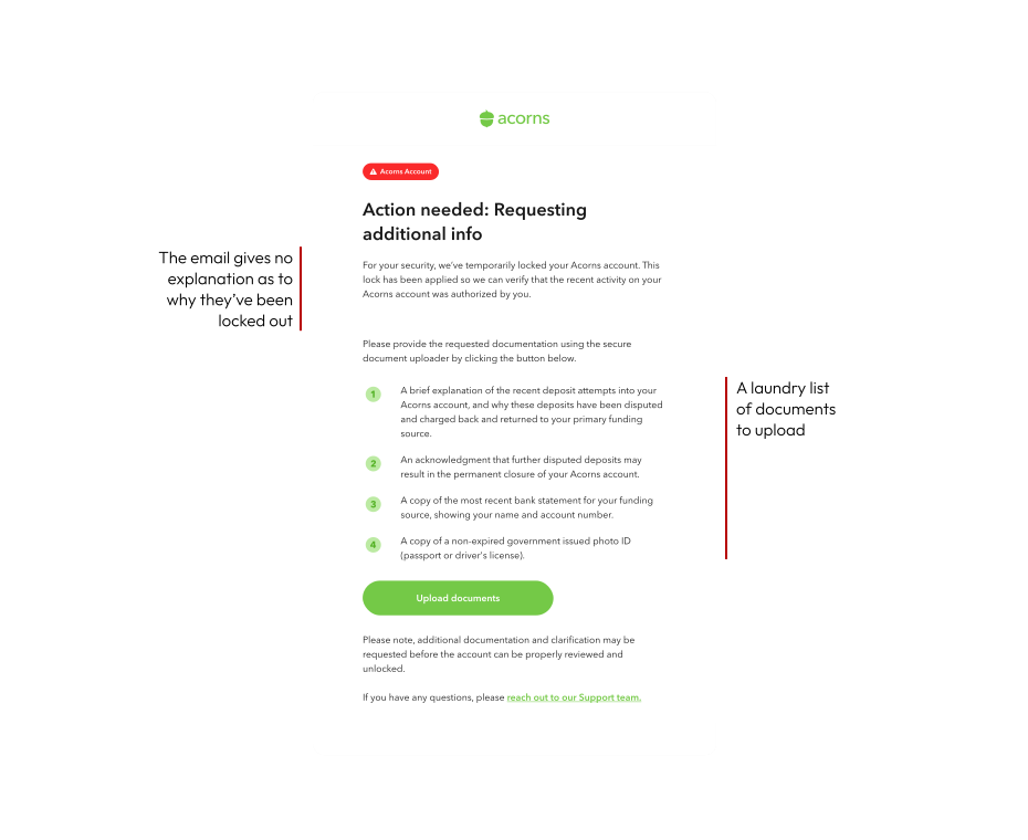
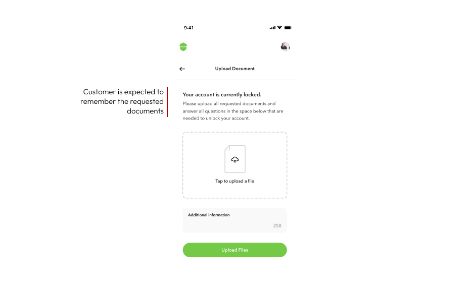
Making complexity feel simple.
Different suspension types needed different combinations of IDs, bank statements, written explanations, acknowledgements, and manual review. But the old uploader flattened all of those into the same generic experience. The challenge was reducing confusion for customers without oversimplifying the compliance complexity behind the scenes.
Replace the generic uploader with a guided experience.
The first big shift was moving away from a static uploader toward a more dynamic flow. Instead of showing every customer the same upload screen, the experience adapted based on suspension type.
Customers could now see:

What documents were needed
Why they were being requested
What still needed review
What would happen next
Early on, I explored a few directions:
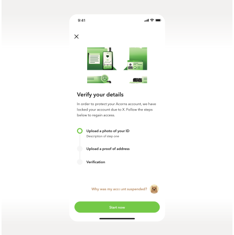
A checklist-based experience
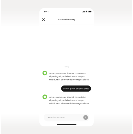
A conversational message-style flow
The conversational direction felt easier to move through and reduced the feeling of being hit with everything at once.
Progressive disclosure helped reduce anxiety.
Early versions surfaced every requirement immediately: upload documents, explain transactions, acknowledge terms, wait for review. It technically worked, but it felt stressful. So I started exploring a step-by-step flow that guided customers through one task at a time. Instead of presenting a wall of requirements, the experience focused on the next thing the customer needed to do.
The AI will guide the customer through the recovery process
The experience starts with exactly what they need, then breaks each step down one at a time.
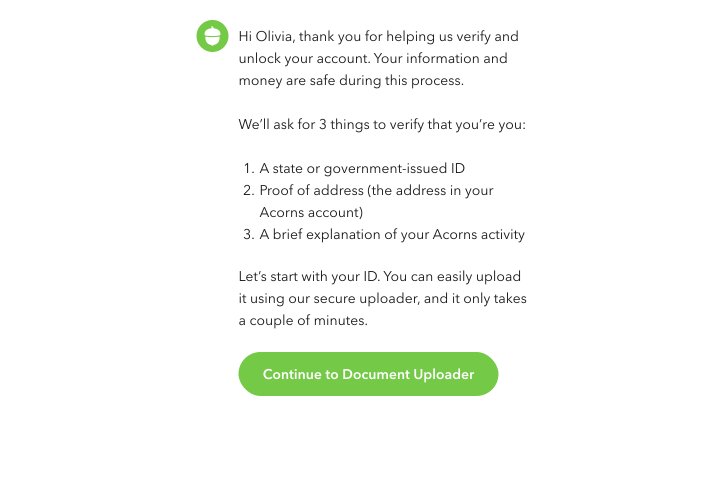
Progressive disclosure
The customer knows what's happening at every step, leaving minimal room for uncertainty.

Account access, even during suspension.
One insight kept coming up while working through the flows: customers were panicking because they couldn't see their money. The original experience basically hard-locked users out of the product. But that made the situation feel even more alarming. So instead of fully blocking access, I designed a read-only account state. Customers could still:
Log in
Access support
View balances
Continue the resolution flow
This ended up becoming one of the most important trust-building decisions in the project.
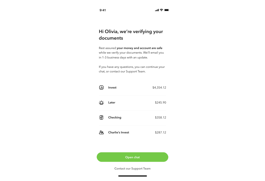
The final experience turned a black-box process into a guided recovery flow.
The final experience replaced the generic uploader with a guided flow that adapted based on suspension type, surfaced progress more clearly, and gave customers more visibility throughout review. It also created a scalable foundation for future verification and support experiences across Acorns. Most importantly, the experience felt more human — instead of leaving customers in the dark during a stressful moment, the flow gave them context, progress, and reassurance.
I learned that trust breaks fast when users lose visibility.
This project changed how I think about high-stress financial workflows. At first, I approached it like a form redesign problem. But the deeper issue was emotional. Customers needed clarity and reassurance just as much as they needed functionality. The biggest lesson was realizing that reducing friction doesn't always mean removing steps — sometimes it just means helping people understand where they are, what's happening, and what comes next. If I revisited the project, I'd spend more time testing how different suspension types changed pacing and trust needs across the flow.