
Experiment 1
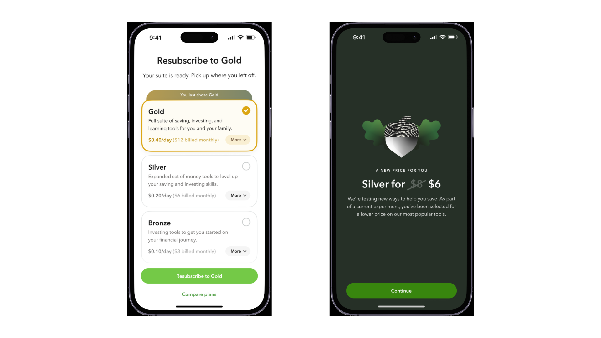
Silver plan pricing
The question
Could Silver move from $6 to $8 without losing subscribers, and would a discount, once revealed, actually improve retention — not just get people through the initial click? A painted door normally just measures a click. We wanted to know if someone who thought they'd gotten a deal stuck around longer than someone who never saw one.
The constraint I held to
We also wanted to redesign the pricing screen around this time. I pushed to keep the two apart. Changing both the price and the UI in one test would've made it impossible to know which one moved conversion. The redesign stayed on the shelf until this test ran clean on its own.
Role
Designed the flow end to end, wrote the discount messaging, built it into the live app.
Result
Conversions held at $8.
Retention impact pending, confirming with my former manager.
Experiment 2
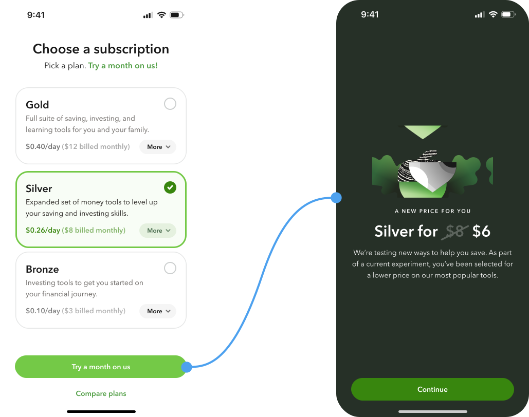
Previous plan reminder
The question
For returning users, what would actually move them through the resubscription funnel faster — being reminded of their old plan at all, or how that reminder was worded? I split UI treatment (banner vs. pill badge) and copy framing (“Resubscribe to Silver” vs. “Renew your Silver subscription”) into separate variables so we could isolate which one was doing the real work.
My working theory
Copy is the first thing someone actually reads, before they register any visual treatment. My hunch going in was that wording would matter more than banner vs. pill. Unconfirmed — flagged as a hypothesis until the real numbers come back.
Role
Designed and built all four variants solo, wrote the copy for each.
Result
Banner, direct copy performed best.
Reminder variants averaged only a slight lift over no reminder at all, roughly 51% vs. 46%, but the direct-copy banner alone beat baseline by 13 points. UI treatment plus tone mattered more than the reminder existing at all.
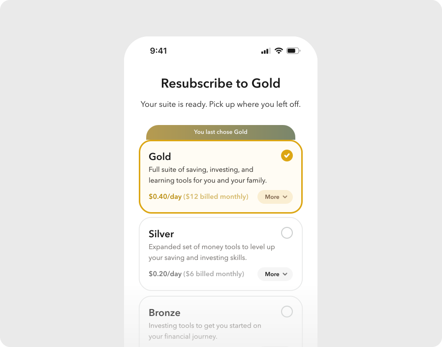
Banner — "Resubscribe to Silver"
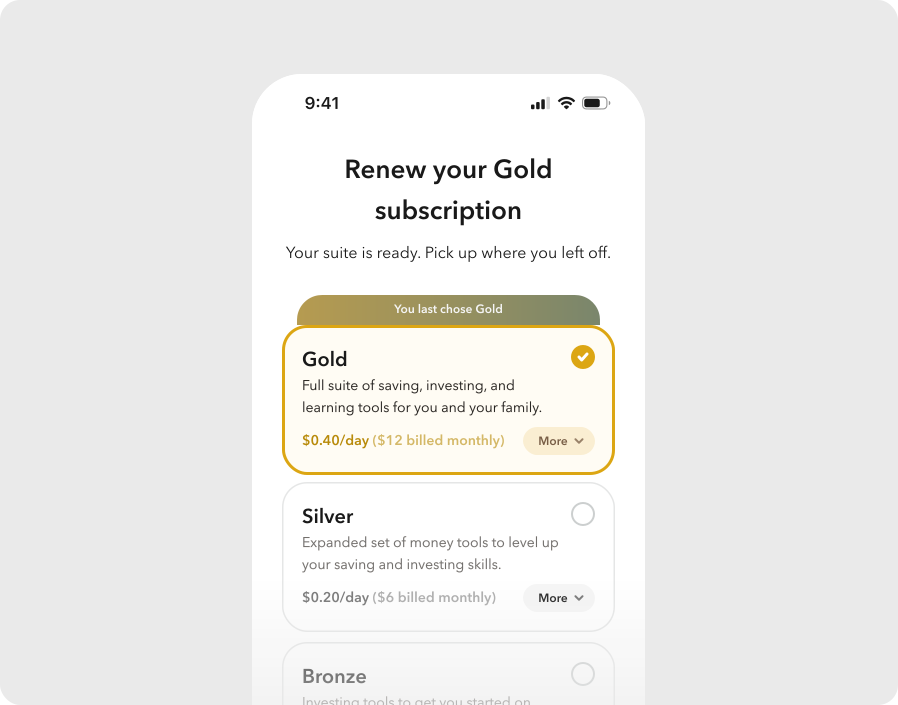
Banner — "Renew your Silver subscription"
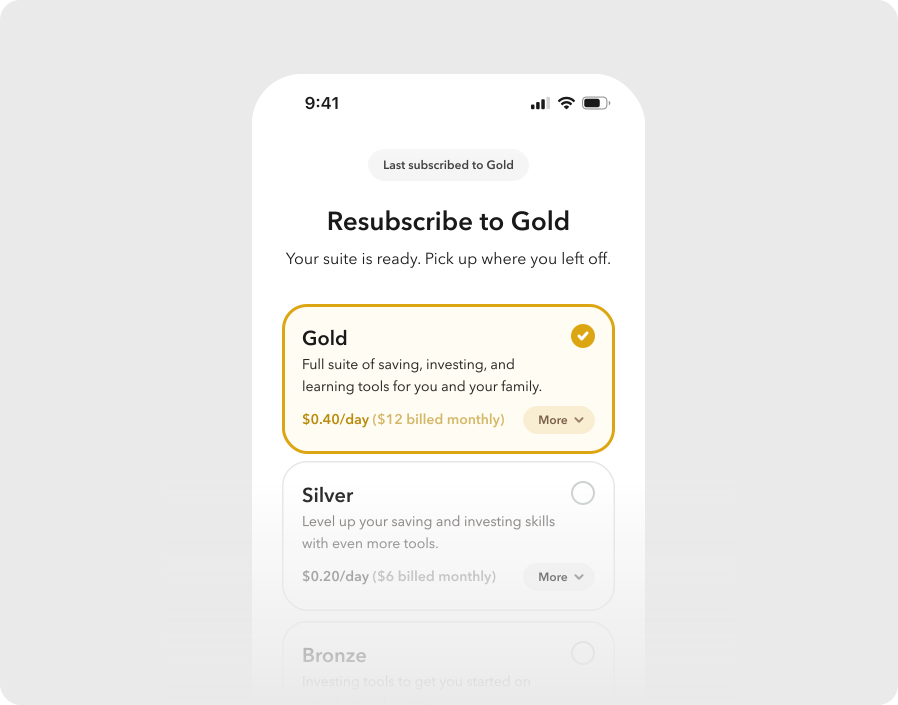
Pill badge — "Resubscribe to Silver"
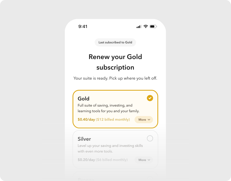
Pill badge — "Renew your Silver subscription"