

Designing for inconsistency became the hardest constraint.
The Tradeoff
A system flexible enough to handle inconsistency, without losing structure.
There wasn't a single workflow to design around. Different agencies documented evidence differently, used different terminology, and prioritized different information. Standardized flows kept getting more limiting the more artifacts we reviewed.
That led to four core features:
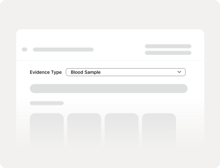
Dynamic forms that adapted based on evidence type
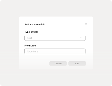
Custom fields for agency-specific workflows
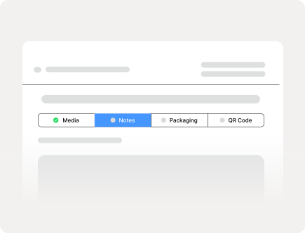
Progressive disclosure to reduce cognitive overload in the field
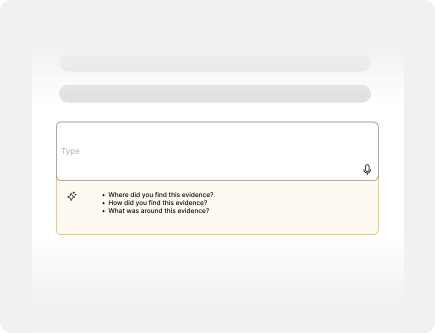
AI-assisted prompts that helped officers avoid missing critical details
AI as guardrails, not automation.
As we learned more about evidence collection workflows, we kept running into the same issue: officers needed to document information quickly, but missing even a small detail could create problems later. We explored more automated documentation flows early on, but the deeper we got into the problem space, the less comfortable full automation felt. In a workflow built around accountability and chain of custody, fully AI-generated reports felt more likely to create distrust than confidence.
Instead of generating reports, the system acted more like a set of guardrails. If an officer documented a knife, the interface could surface prompts they might otherwise forget — details about handling, location, or related evidence. The goal wasn't to replace human judgment, but to support it.
So we intentionally designed AI to stay in the background.
The biggest pivot came from something we didn't hear in interviews.
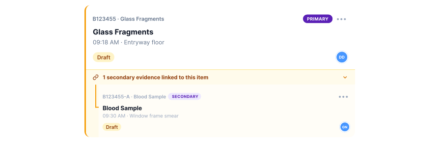
One of our most important insights came late in the process. During synthesis, we realized evidence rarely exists in isolation — a blood sample connects to a weapon, a fingerprint to a broken object. None of our interviews explicitly revealed this; we uncovered it through artifact analysis and workflow mapping. Once we saw the pattern, we redesigned the case summary experience to support parent-child evidence relationships. We explored several directions:

A traditional table view
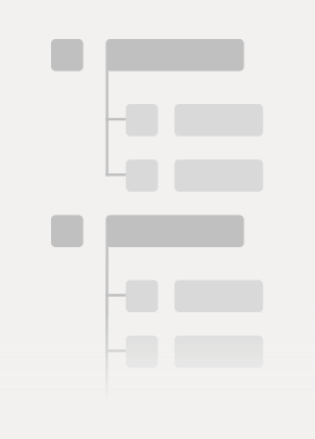
A folder/tree structure

A linked-card model
We chose the linked-card approach because it preserved fast scanning while still making relationships visible at a glance.
Usability testing exposed where clarity mattered more than features.
There was one recurring issue that came up in usability testing: language. Terms that felt obvious to us weren't obvious to officers. We made a series of targeted refinements that improved comprehension and flow. One participant summed it up well: 'This would make our work faster.'
Redesigning the 'Activity Log' to a proper 'Chain of Custody' section with important information upfront
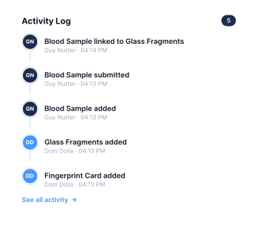
Before
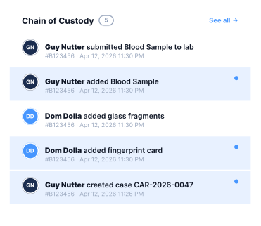
After
Adjusting the status indicators to match terminology used in the industry today
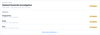
Before
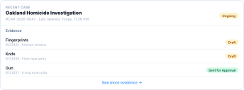
After
Changing 'Parent/Child' to 'Primary/Secondary'
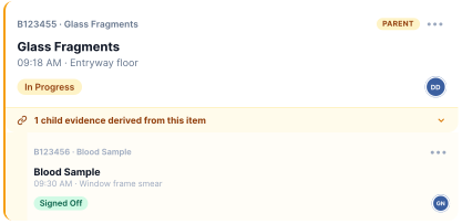
Before
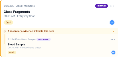
After
The final system balanced structure with flexibility.
While SampleCSI isn't live yet due to funding limitations, usability participants consistently described the system as faster and easier to navigate than current documentation processes.
AI also became part of how we built SampleCSI.
There was something a little meta about this project: we were designing an AI-assisted tool while actively using AI tools ourselves. That wasn't the original plan, but it became one of the more interesting parts of the process.
We used AI tools to:
- Synthesize interview transcripts
- Brainstorm information architecture
- Build high fidelity prototypes
- Draft usability testing scripts
Each of those tasks had a different character. Synthesis was actually the one that humbled us first. We fed in raw transcripts expecting organized, usable themes and got back output that sounded polished but felt generic — it missed the deeper patterns actually emerging from our interviews. We ended up stepping away from the AI-generated summaries and returning to manual affinity mapping to find more grounded insights ourselves.
Brainstorming was more useful for breaking logjams, even when the suggestions weren't right. Prototyping with AI was the most surprising: it could produce realistic UI in minutes, which let us test more directions than we would have otherwise. Drafting testing scripts required the most oversight — the outputs were plausible but often leading, framing questions in ways that pointed users toward the right answer.


We used ChatGPT for broad brainstorming and quick iteration. Claude was better for longer, more structured tasks where we needed it to hold a lot of context at once. Granola handled meeting notes and kept our synthesis sessions from disappearing into a folder no one opened again.
The biggest thing we learned was that AI worked best when we already had a strong point of view. When we came in with a clear question, we got useful output. When we came in vague, we got confident-sounding noise. And when we leaned on it too early — before we had done the hard interpretive work ourselves — it gave us the illusion of progress without the substance.
That changed how we structured our working sessions. We started front-loading more alignment work between team members before involving AI, and we got more deliberate about returning to our own research to evaluate whatever it generated.
Ironically, that mirrored one of the core ideas behind SampleCSI itself: AI worked best as augmentation, not replacement.
I learned that workflow design isn't really about screens.
It's about understanding how people make decisions under pressure. If I revisited this project, I'd spend more time validating edge cases earlier, especially around evidence relationships and multi-agency workflows. Our biggest pivot happened relatively late, and earlier questioning could have surfaced it sooner. This project also changed how I think about usability testing — watching users hesitate in real time taught me that clarity often matters more than feature depth, especially in high-stakes environments where confidence and speed are tightly connected.