


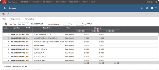
Designing for inconsistency became the hardest constraint.
Chemists and process engineers both used Compare Formulas, but for completely different reasons. Designing one view to serve both meant serving neither well.
Chemists
Needed to compare and edit ingredient amounts
R&D chemists were checking percentages across formulas, catching math errors, and making small adjustments before locking formulas for production. They needed a fast, editable comparison view.
Process Engineers
Needed to see formulas in phase sequence
Process engineers were checking the order and structure of how ingredients would be added on the manufacturing line. They needed to see formulas organized by phase, not just a flat list of ingredients.
Split the workflow instead of forcing one view to do everything
The Decision
One dense table trying to satisfy everyone became two clearer views, each doing one job well.
My early explorations tried to combine ingredients, percentages, phases, formula sequence, and editing into a single comparison table. That approach quickly broke down as we realized users had two distinct needs. Adding phases made formulas harder to compare, creating what we called a ‘Tetris’ problem — different phase structures no longer aligned cleanly. This led to the design decision to create two different views.
Turn comparison into action
The Decision
Comparison stopped being read-only. Chemists could edit ingredients directly instead of switching tools to fix what they found.
The biggest improvement over Optiva was making comparison actionable. Instead of finding issues and switching tools to fix them, users could make simple edits directly in the comparison view and follow guided flows for more complex changes.
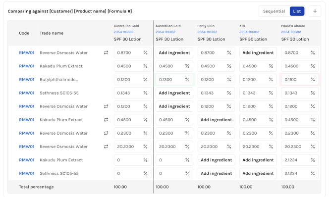
Small visual cues made dense formula data easier to trust.
The Decision
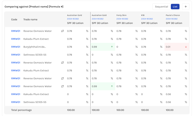
Color cues carried over from Optiva, then extended to catch repeated and missing ingredients too.
In Optiva, users relied heavily on visual comparison. Higher and lower amounts were highlighted against the reference formula, which made differences easier to catch. I carried that behavior into Element AI.
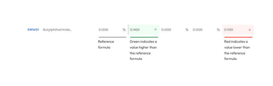
I also added cues for edge cases that came up in user conversations and design critiques. If the same raw material appeared multiple times, users could quickly identify repeated ingredients instead of manually hunting across the table. If an ingredient existed in one formula but not another, the interface made that absence visible instead of hiding it.
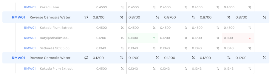
The final design turned a static report into a clearer, more actionable workspace.
A chemist, during review
“This is going to make my life so much easier. I'm very excited to use it.”
Compare Formulas has been built and users are beginning to use it in Element AI. Because the feature is still early, I don't have long-term usage metrics yet. But initial reactions were positive. The final experience helped move a critical Optiva workflow into Element AI while improving on the original tool through clearer context, multiple comparison views, and editing support.
I learned that migration work is really behavior-change work.
This project taught me that migration work is not just about feature parity. Users needed the new tool to feel familiar enough to trust, but better enough to justify switching. The hardest design decisions came from figuring out what to preserve, what to improve, and what to simplify for the first release. If I revisited this project, I would validate edge cases earlier, especially around phase alignment and missing ingredients. Those details looked small at first, but they shaped the entire interaction model. The final product was stronger because we let the messy middle influence the design instead of hiding it.